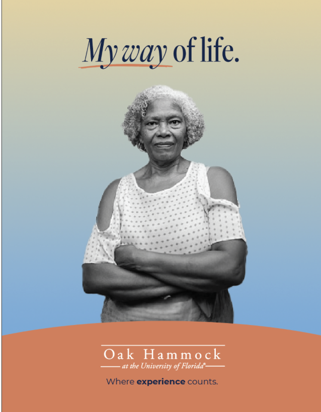
Oak Hammock
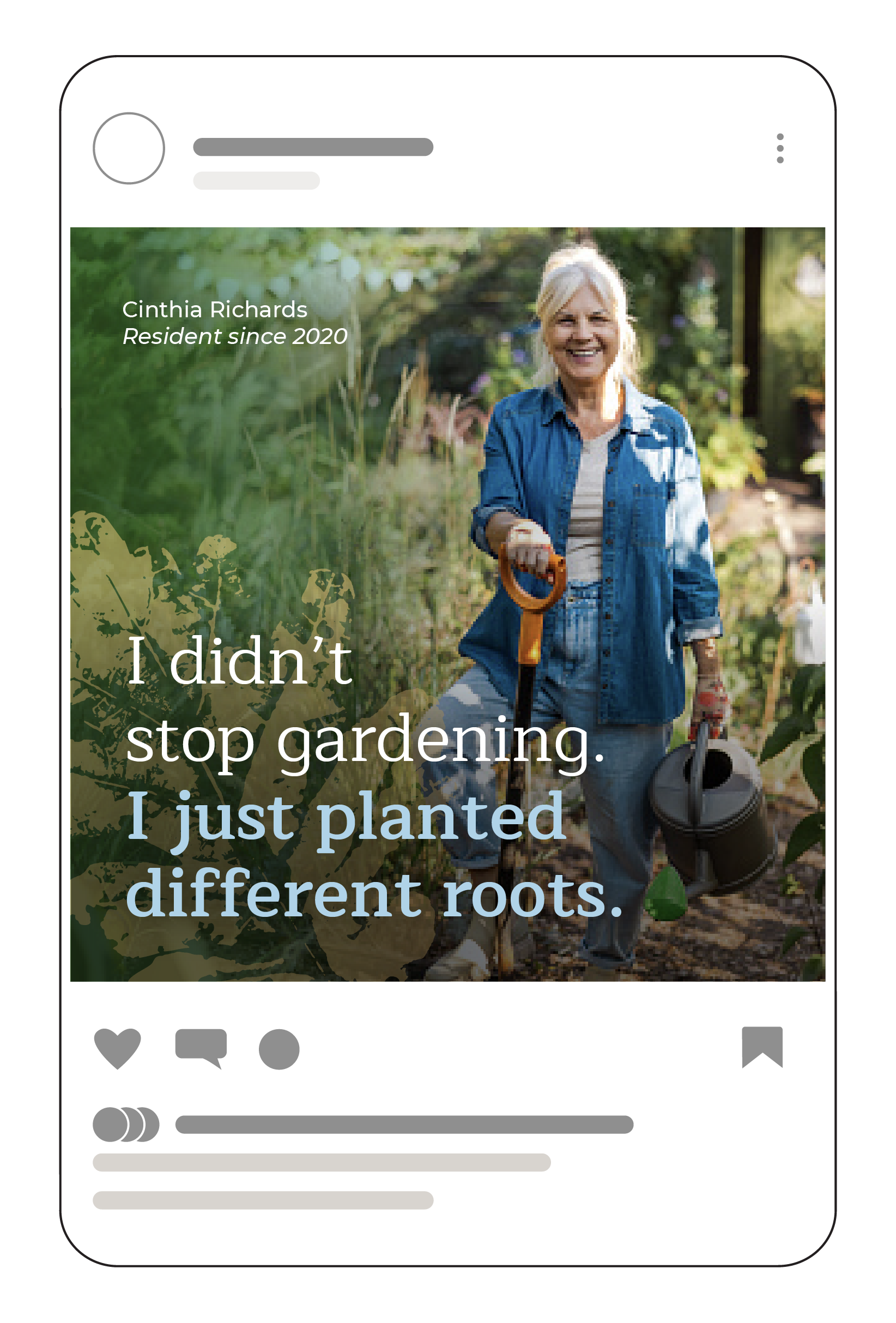
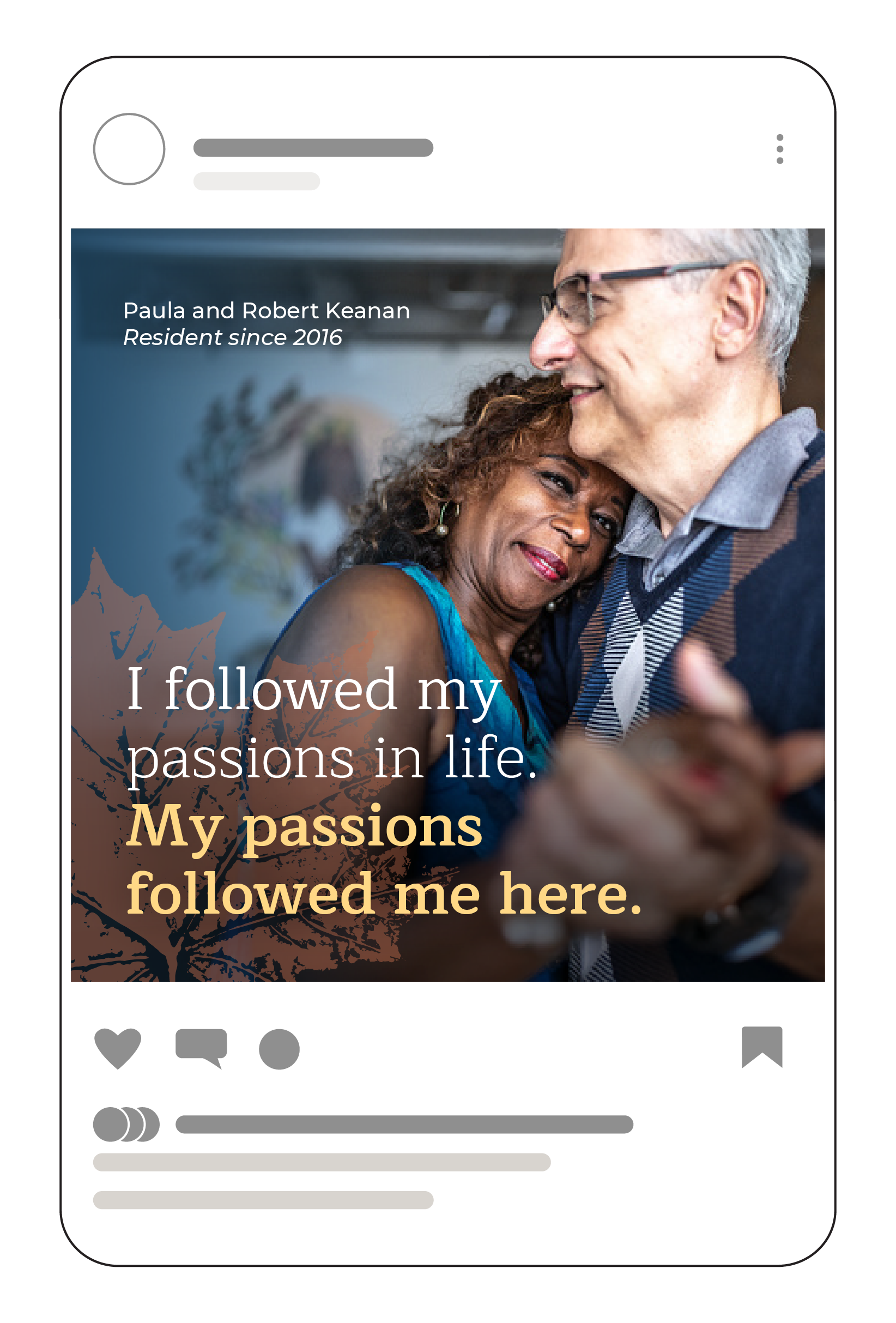
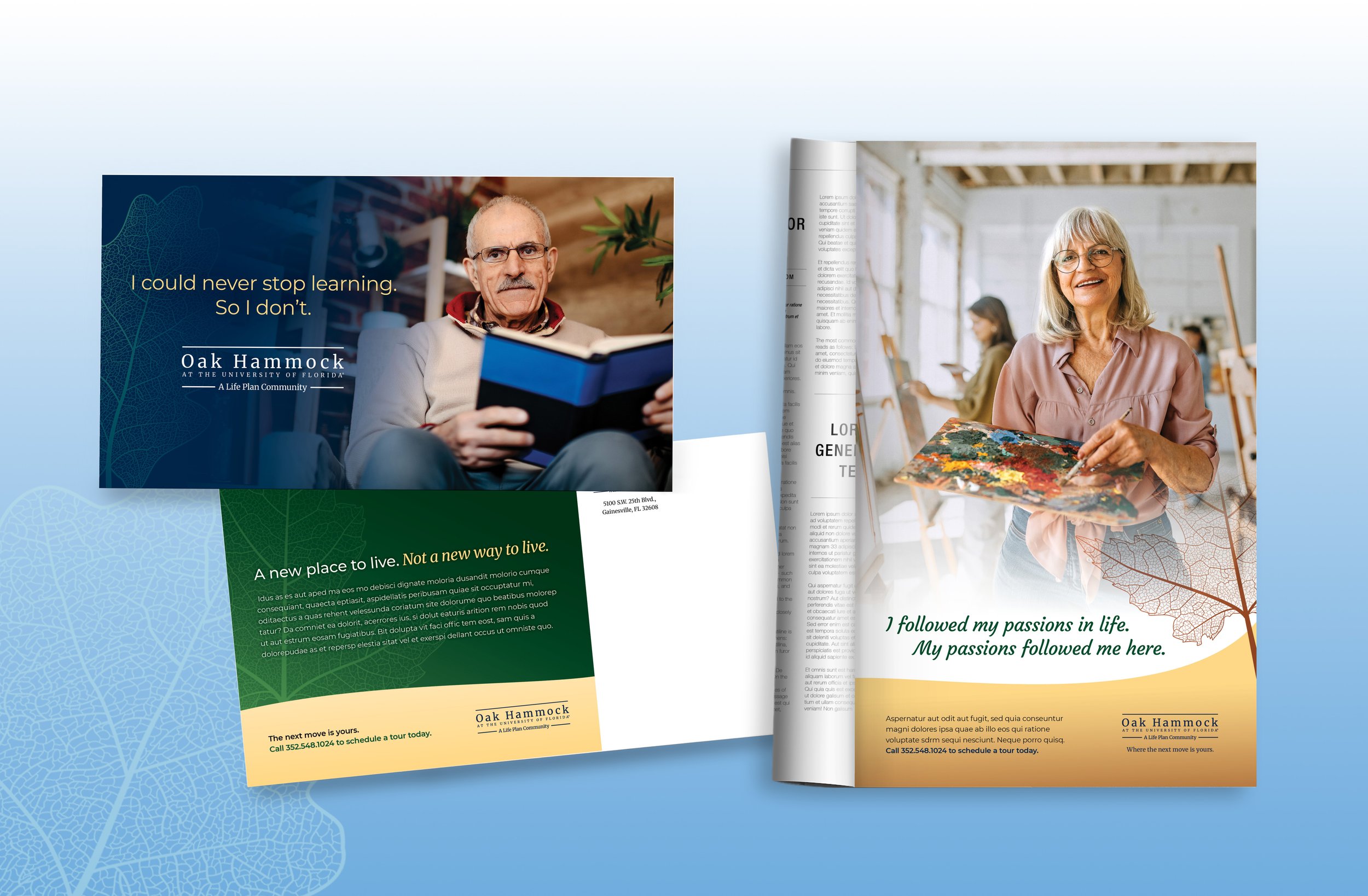
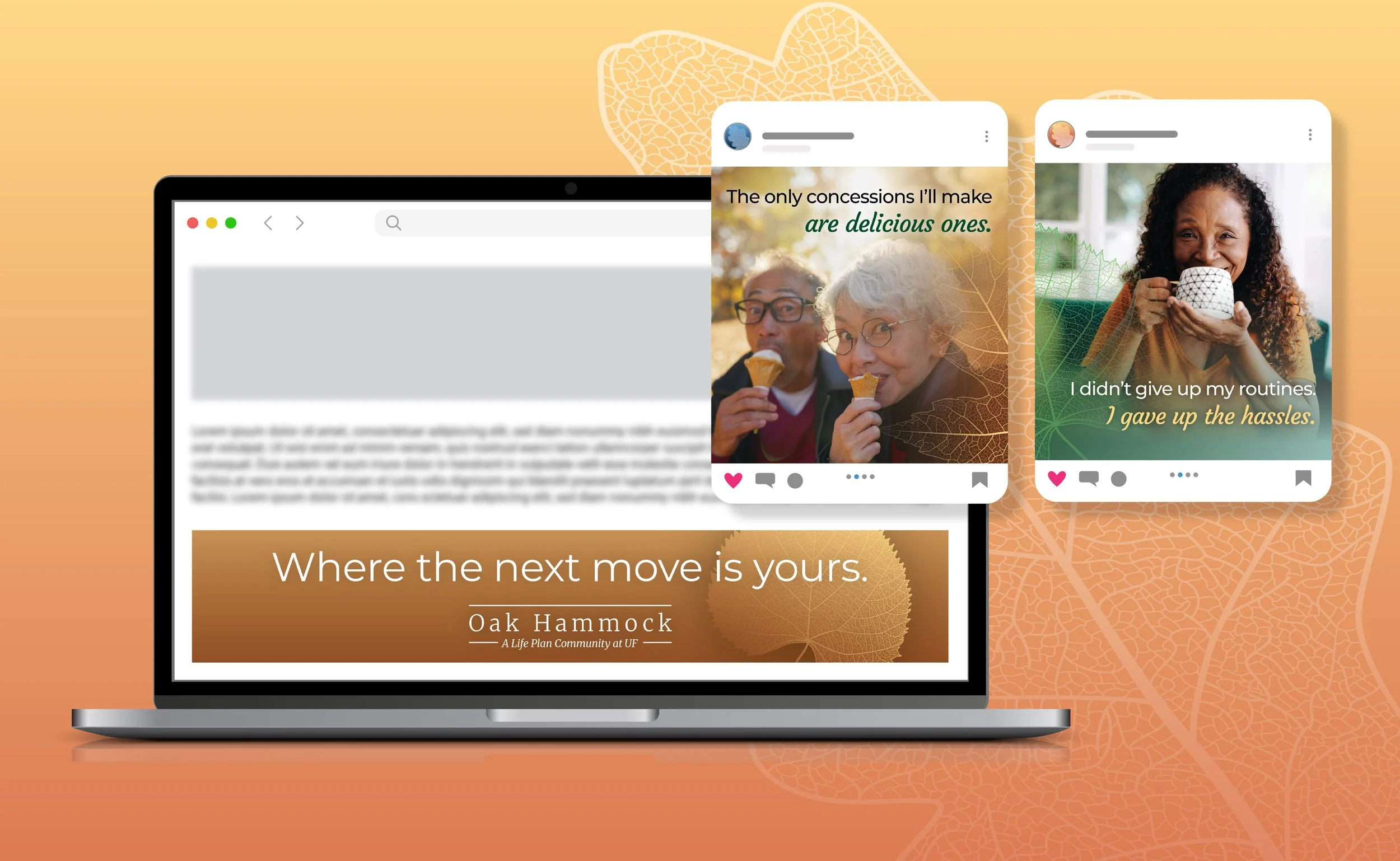
Oak Hammock needed a brand that more authentically reflected its residents and environment. The client was clear on what they didn’t want: the tired clichés of retirement community marketing. Oak Hammock is not a new beginning, but where life keeps going on your own terms. As the primary designer, I led the full identity refresh across color, typography, and imagery, then built out a comprehensive brand guide that holds it all together. The result balances warmth, sophistication, and the deep connection to the natural landscape of the Gainesville area.
BRANDING IDENTITY | DIGITAL & PRINT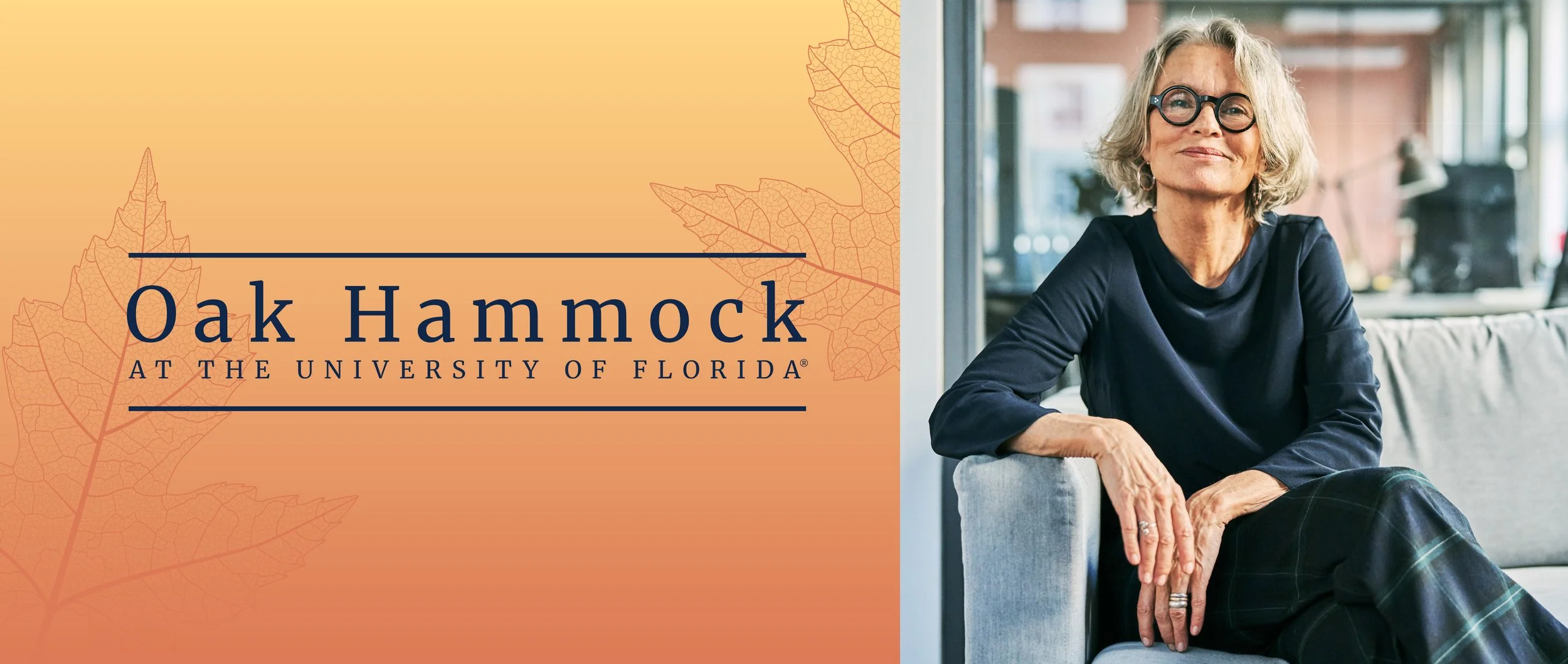
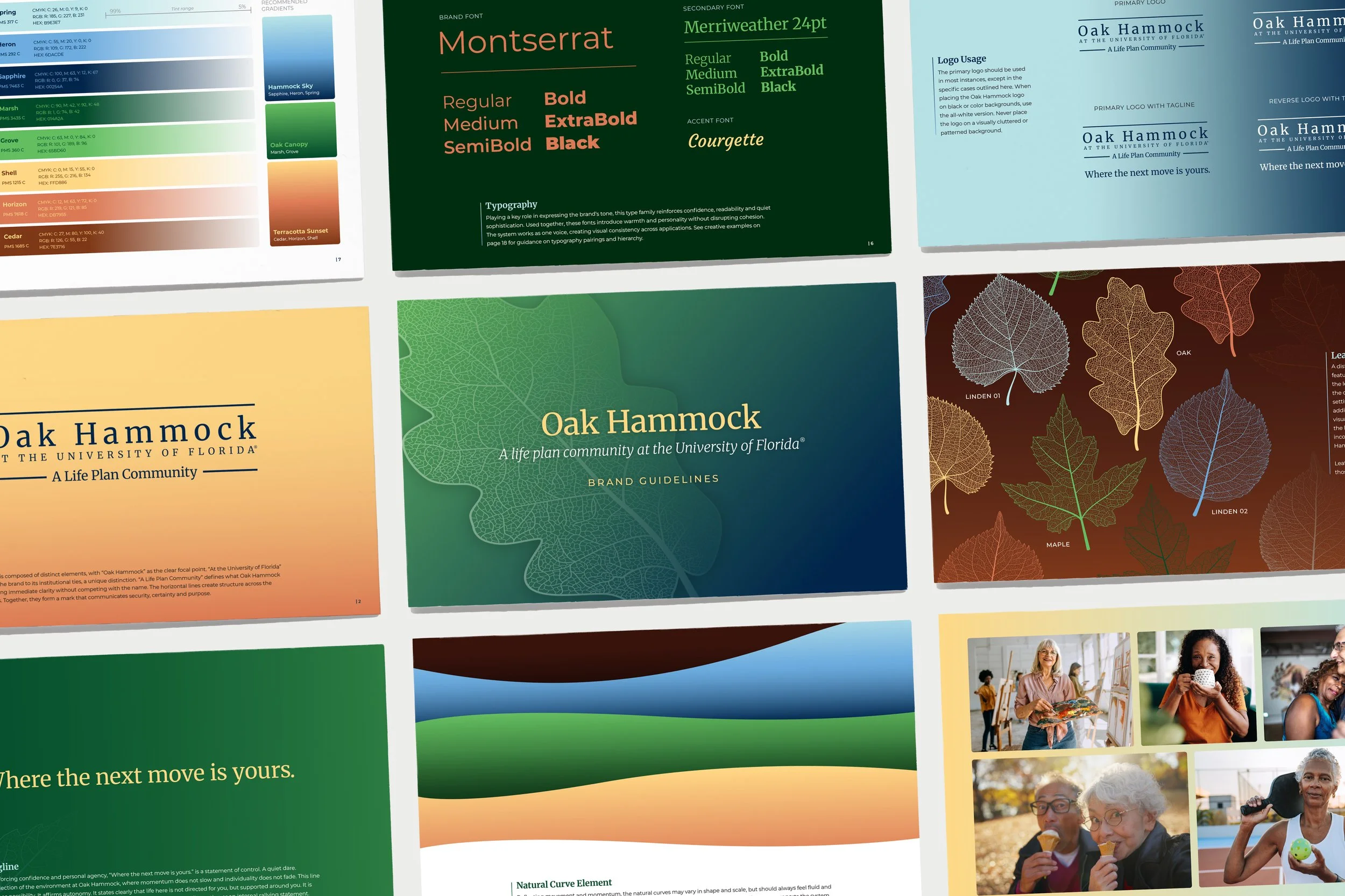

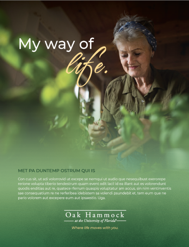
PROCESSThe identity began with a moodboard establishing the visual and tonal direction, pulling inspiration that captured the balance of warmth and sophistication the brand needed. Alongside the visual exploration, I collaborated with the team to build a headline bank and brainstorm the brand tagline, ensuring the voice and visuals developed in tandem. From there, the project moved through multiple rounds of concept design, refining the logo, color, and type system until each element felt cohesive and intentional.