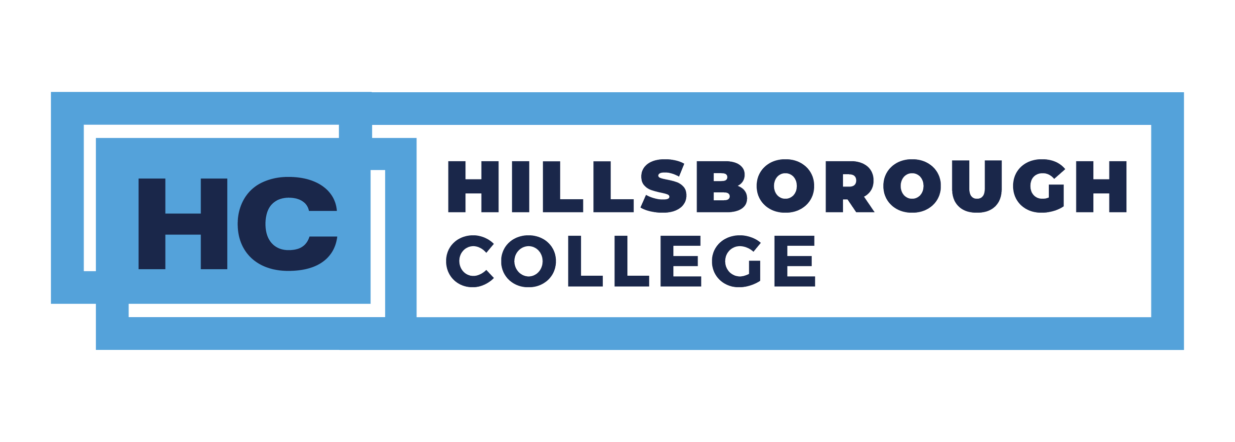
Hillsborough College
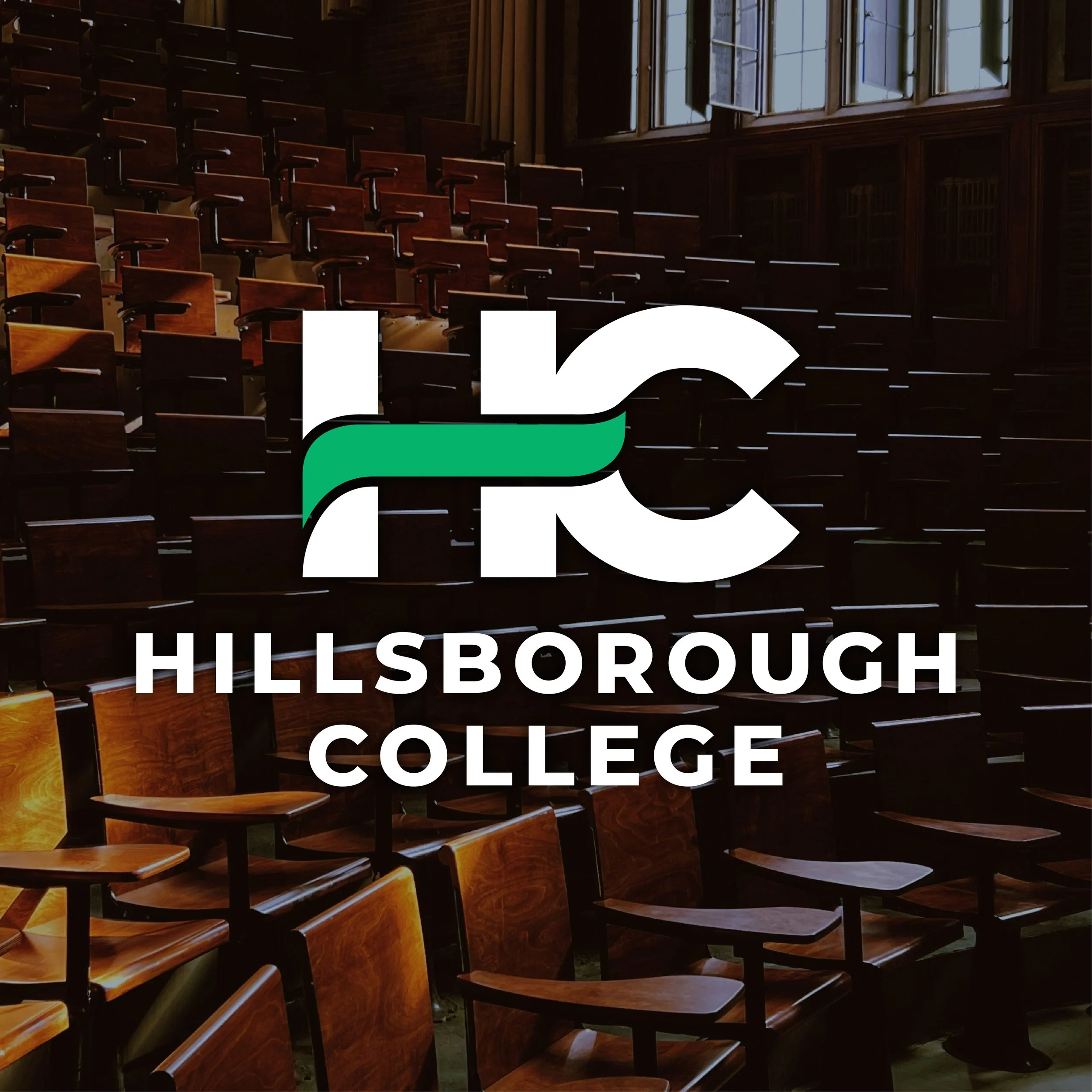
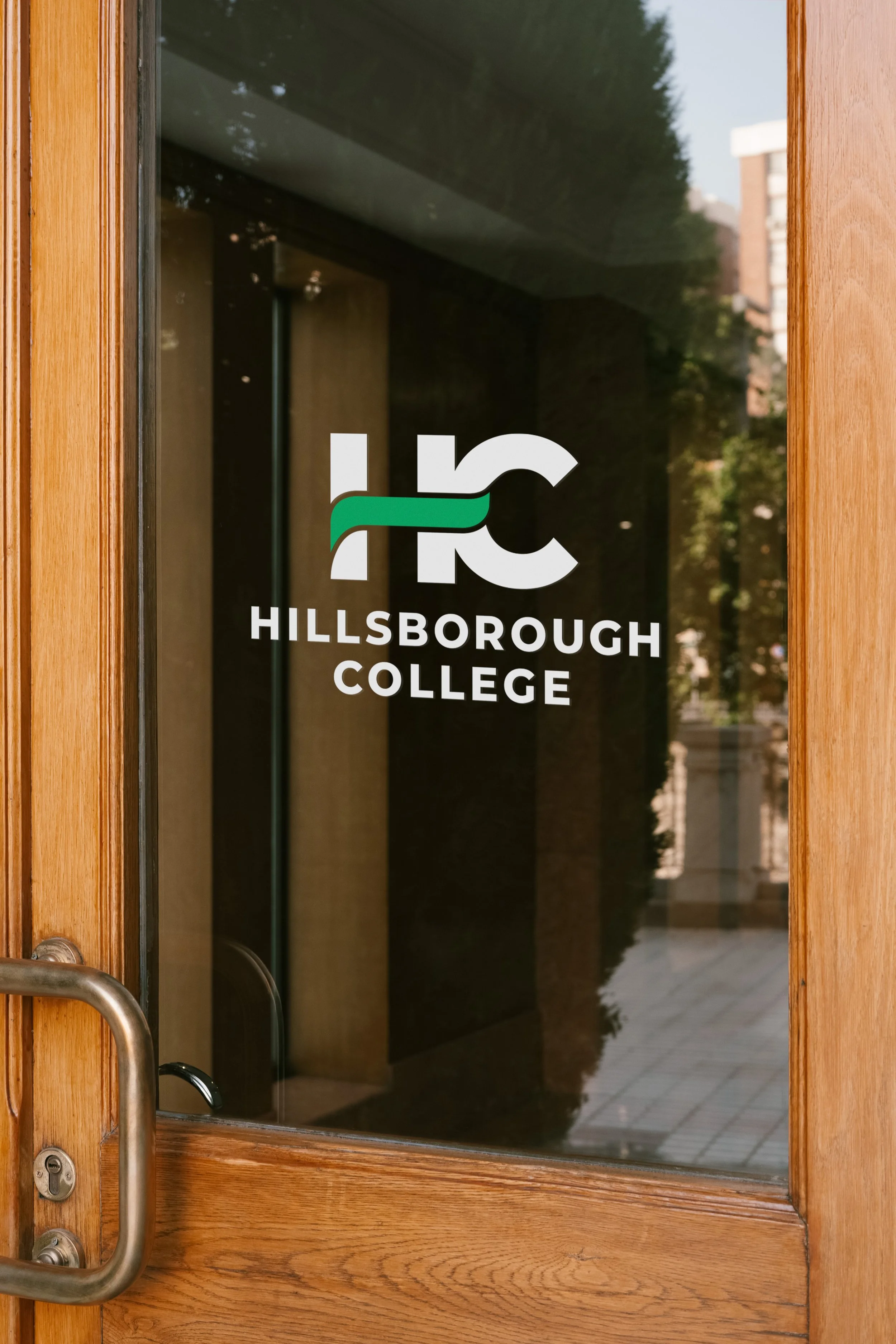
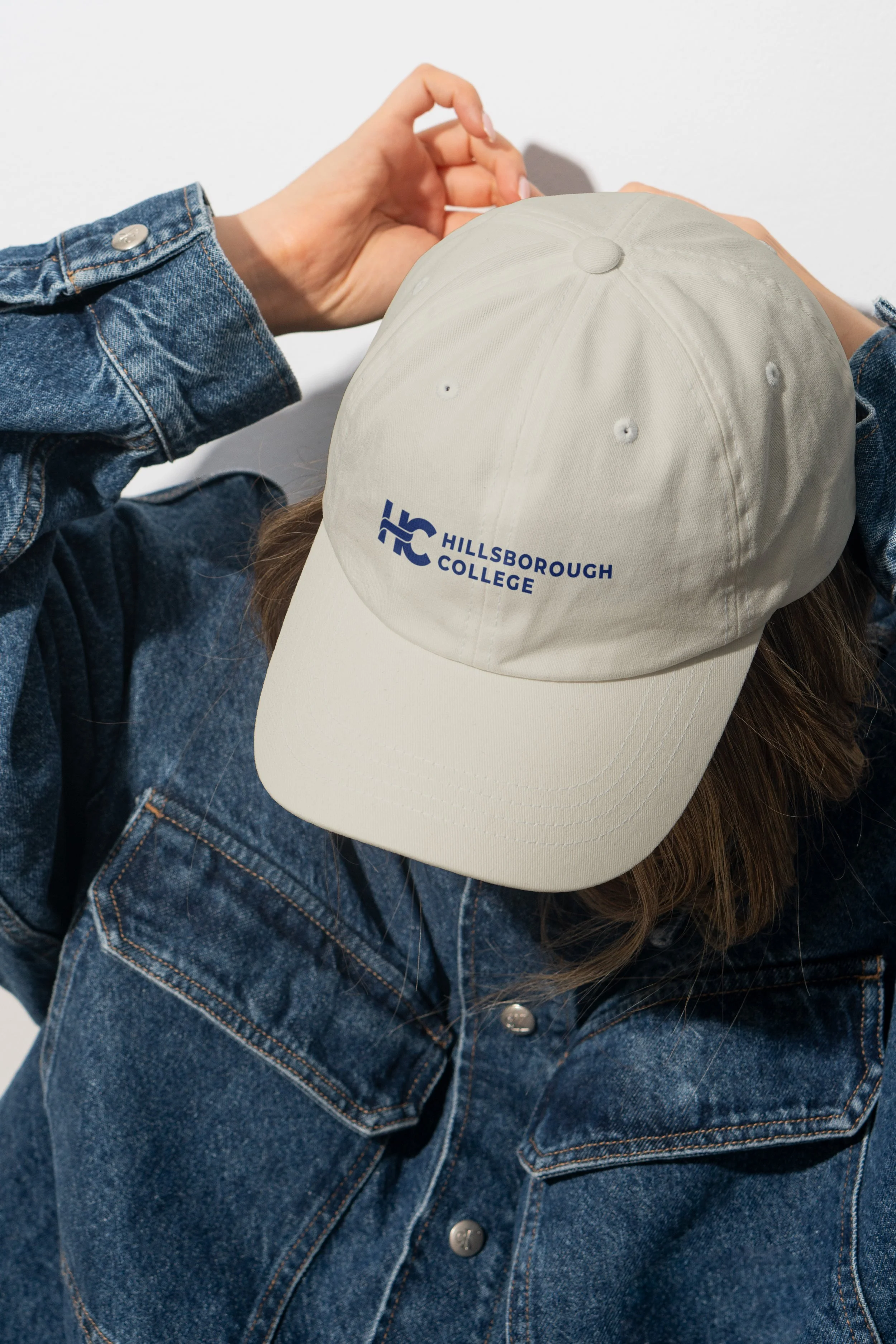
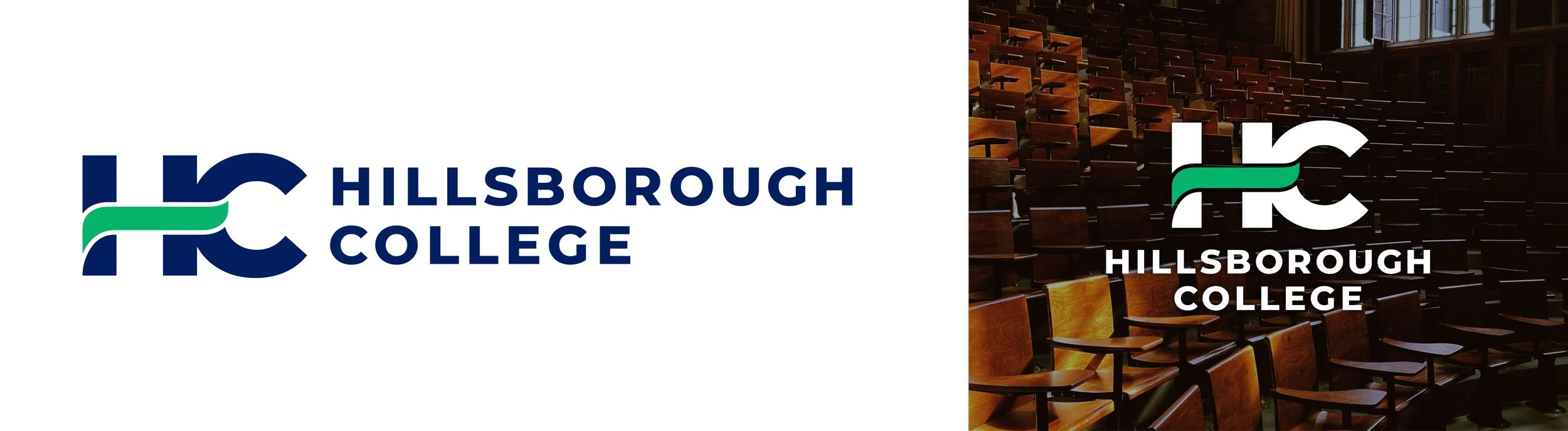
When Hillsborough College dropped "Community" from their name, they needed a logo that honored their roots while signaling a bold new direction. Inheriting a stalled project from another agency, we moved quickly. I crafted the interlocking letterforms that communicate movement and connection, with a curved crossbar that quietly references their hawk mascot. The mark balances innovation with community at its core. The result was featured in the Tampa Bay Business Journal.
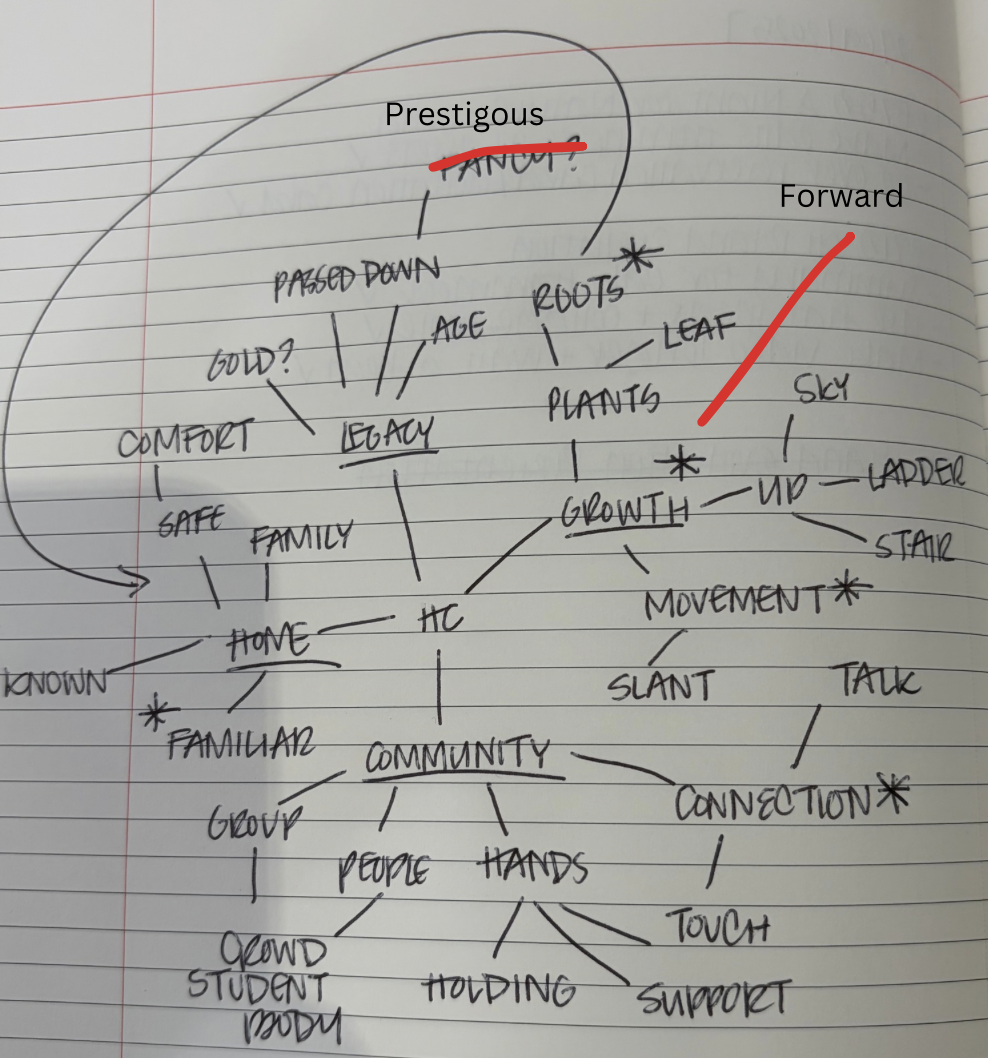
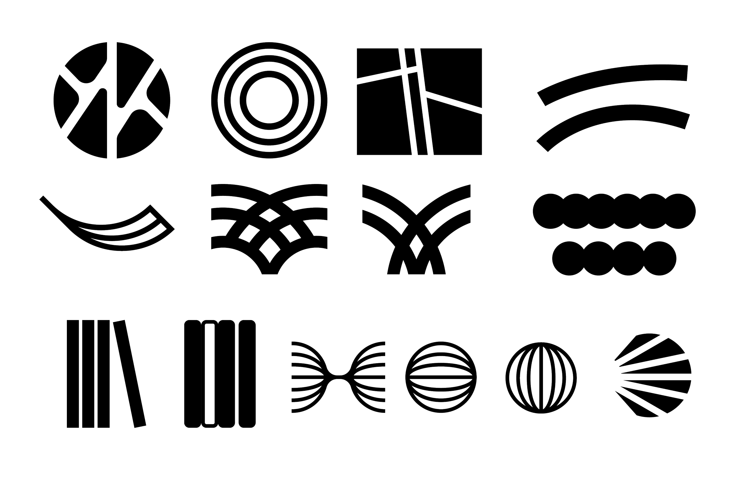
TYPOGRAPHY | BRAND IDENTITYPROCESSMy process began with word mapping - unpacking concepts like community, growth, and movement to inform the visual language the mark needed to carry. From there I explored broad shapes and forms that embodied these ideas and narrowed them into more refined letterform combinations. What’s shown here is a small selection from over 100 sketched concepts, each testing a different approach to connect the “H” and “C” in form movement and visual balance.